Thanks for your interest in taking a deeper dive after my Lean Startup Week talk.
This page includes:
- Slides
- Info on how to calculate control limits
- A link to the “Western Electric rules” that are used to evaluate charts
- Details about the charts I used in my talk
- More information about the “red bead experiment” that I facilitated.
Upcoming Book Project
I am working on a book / workbook on this topic… I am treating the book as a Lean Startup, where I am still looking for product / market fit. The technical risk is low, but the market risk still seems high. Please learn more and give feedback via:
- The page on LeanPub.com
- The page on my website (you can also sign up to get more info)
My Slides
How to Calculate Process Behavior Chart Limits:
See this blog post for instructions | PDF handout from my workshop on this method
Or see this video tutorial (updated 2019):
See the full webinar that preceded the “bonus content” on creating charts.
Also, check out this blog post about how to do this.
Note: The terms “control chart” and “process behavior chart” are sometimes used interchangeably in this field. A process behavior chart is a specific type of control chart, very similar to what's called a “control chart for individuals” (individual data points).
The terms “upper control limit” and “lower control limit” are the same thing as the upper and lower “process behavior limits.” The methodology is the same… sorry for any confusion on terminology.
Rules for Evaluating the Charts
See the “Western Electric rules” for the rules / heuristics for evaluating process behavior charts and data points. You can also download this PPT summary.
Don Wheeler's Book
My book recommendation from my talk (read about why Understanding Variation is my favorite book ever):
Calculations for New Premium User Registrations
I used 12 data points to calculate the average and other baseline limits. It's ideal, statistically, to have 20 initial data points, but there are diminishing returns from having more data points than that to start. 12 is fine.
Six or eight data points would be OK to start, but I would generally recalculate the baseline average and process behavior limits after reaching 12, 16, 20 data points.
That said, beyond 20 data points, do NOT continually recalculate process behavior limits after each new data point. The average for the chart should not be a “rolling average” or “moving average.”
I used an Excel spreadsheet (download via Dropbox link).
- The daily data is in column B
- The average was calculated as =AVERAGE(B2:B13) as those are the baseline data points I had
- If I had 20 historical data points to start, I would have used 20
- Column D is the “moving range” or the absolute value of the change between each successive data point =ABS(B3-B2) for example.
- There is no initial MR for Day 1 since there's no “Day 0” data point to compare it to
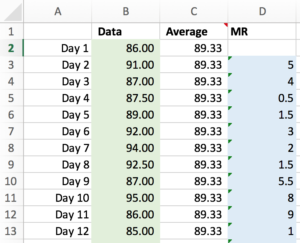
- Then, the “MR bar” (the average of the moving ranges) was calculated as =AVERAGE(D3:D13)
- The “3-sigma” upper process behavior limit is =C3+3*D3/1.128
- The “3-sigma” lower process behavior limit is =C3-3*D3/1.128
- For more complex “Western Electric rules,” the 1-sigma and 2-sigma limits are calculated by replacing “3” with “1” or “2” in that formula
The MR bar and process behavior limits look like this:
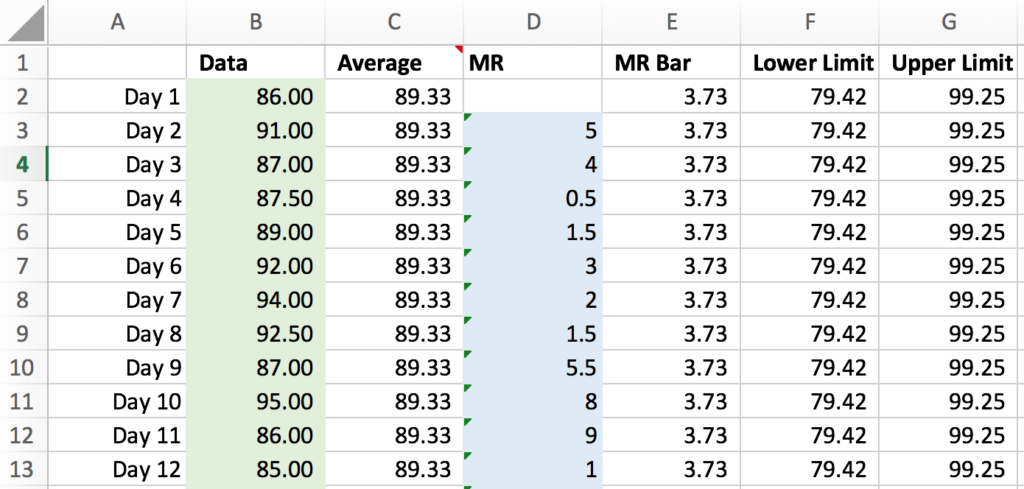
The bottom red line (lower limit) in my slide was 79.42, the top line (upper limit) was 99.25)
Again, you do not CHOOSE what these limits are. They are calculated from formulas and they represent the “voice of the process” (or at least the voice of the baseline data). The limits are different than targets or goals.
In the spreadsheets, you'll see a second companion chart for each data set, the “MR chart” where we chart the moving ranges and calculate an average and upper limit. Using this second companion chart is statistically correct, but is often not used in the real world. Using the main chart with the data itself will provide a lot of value on its own. The MR chart helps make clear when there is a huge unusual swing up or down in the data that's not likely due to randomness. You can eyeball that in the main chart, so I usually don't use the MR chart.
Calculations for Tier 1 Leads
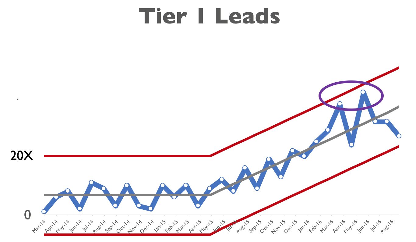
Note that this Process Behavior Chart is asymmetrical since no data point can be negative here. A similar thing happens on a chart where 100 is the highest possible value.
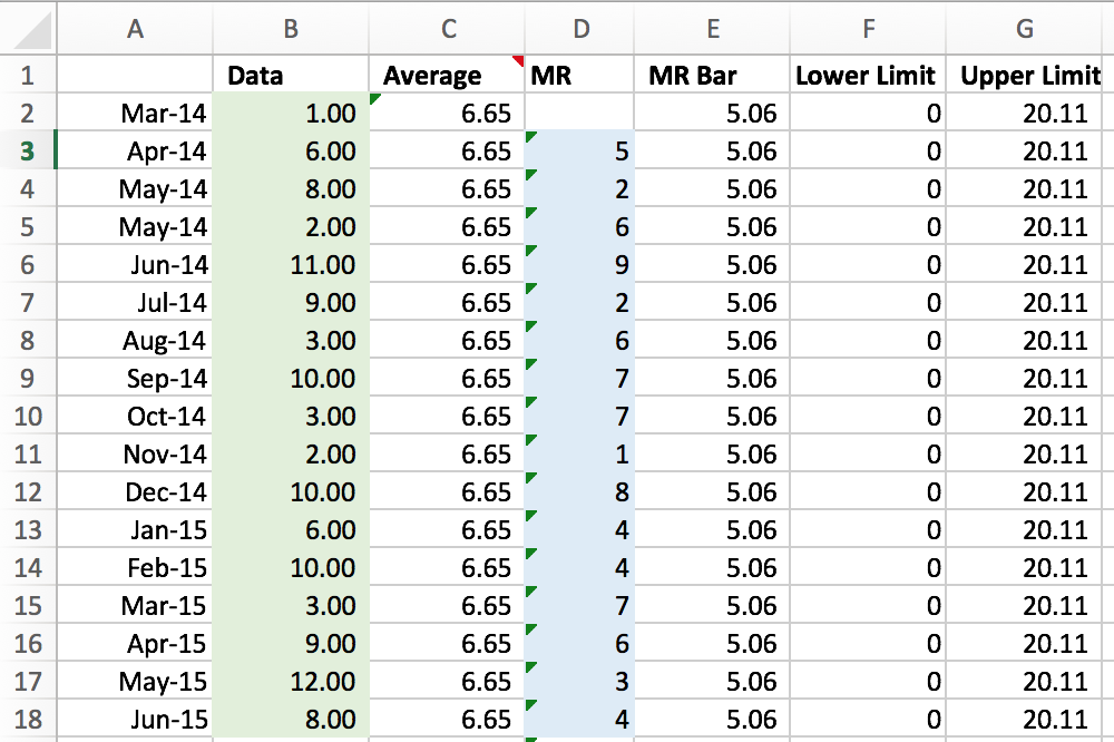
The same method was used as above, but I had 16 baseline data points to use for the Average and MR-Bar:
Click to download the spreadsheet (via Dropbox)
The average number of Tier 1 Leads was 6.65. The average moving range (MR bar) was calculated to be 5.06. The Lower Process Behavior Limit is bounded at zero because the number of leads cannot be a negative number. The Upper Limit was calculated using the same method as above. Again, this is the “3 sigma” limit.
The process for calculating the limits for the “growth trajectory” phase is a bit more involved and complicated. Another approach is to chart the “growth rate” (positive and/or negative numbers) and you can then use the Process Behavior Chart method on that and the limits will be consistent horizontal lines until there is a shift in performance.
There's a signal in the growth trajectory phase… 2 out of 3 consecutive data points very near the upper limit (I should have marked this in my presentation slide). Do we understand why there's a signal? No, I'm not sure.
The key is not making the chart and finding the signals… but the effort that then goes into driving improvement — asking why and understanding the system.
Monthly LeanBlog.org Traffic
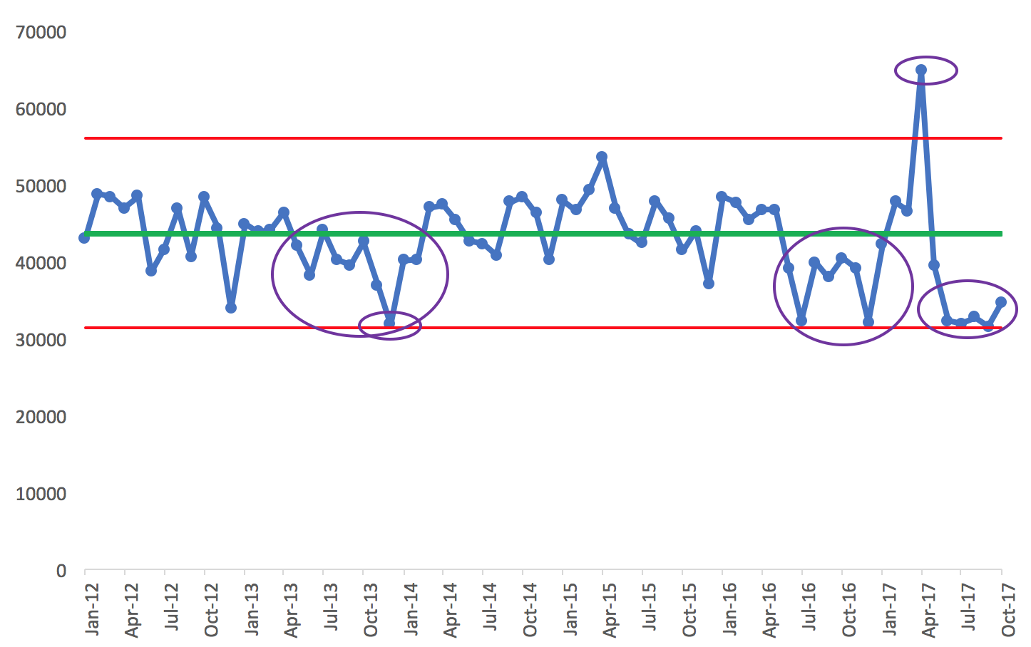
For the “uptick” and broader data about my blog traffic, I didn't show a Process Behavior Chart. But, it would look like the photo below (and it's been updated to include September and October 2017 data). You can download the spreadsheet via Dropbox.
The average (43670) and the upper (55976) and lower limits (31364) are calculated from the first 20 data points as a baseline period.
Looking at signals, the first small purple oval is a point (December 2013) right at the lower limit (just 300 page views higher than the limit). Being lower than the lower limit suggests (with high statistically certainty) that there is a signal to look for, a special cause explanation for the data point. This is supposed to be a “black and white” methodology (is there a signal or not), but I'd probably still investigate to look for a reason for the low month.
That data point is also part of a grouping of 10 consecutive data points that are below the average (the third of those being just about 300 higher than the average, in July 2013). The Western Electric rule looks for eight consecutive points above or below the average. I'd probably investigate to see if there's a good reason why blog traffic was lower in that time frame (I don't know why, in hindsight).
Later, starting around July 2016, there's eight consecutive data points below the average — a signal. Then the single point above the upper limit in April 2017 (the result of this very popular blog post about United Airlines).
Then, we have a cluster of points very close to the lower limit (the Western Electric rule says 2 out of 3 points near the limit would be a signal).
Related Blog Posts
Here are some related blog posts that I wrote in advance of Lean Startup Week (see all with this tag):
Stop Wasting People's Time (in a #LeanStartup or any Organization) by Separating Signal From Noise
How “Process Behavior Charts” Save Us Time and Help Us Sleep Better at Night
Red Bead Game / Experiment Resources
See this page with more info, webinars, links and more
I'd love to hear what you think. And I'd love to help you and your organization with these methods and mindsets. Please contact me if you're interested in talking or in having me coach you.
If you use these methods, I'd also love to hear about what works well, what you learn, etc.

